Friday, 15 November 2013
Sunday, 3 November 2013
Thursday, 10 October 2013
Wednesday, 28 August 2013
Tuesday, 25 June 2013
EXP3: Final Submission
3 Texture apply on Bridge
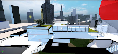
5 real time image
Cry engine File:
Sketch up:
PDF original File:
Animation:
Folly walk through
Student Elevator
Dean elevator
Monday, 20 May 2013
Friday, 10 May 2013
EXP3: 18 one point perspectives
MASHUP
All
things in nature have a shape, a form, that don’t need to ornaments, ornaments are unnecessary and ornaments does not increase aesthetics value, does not increase the pleasure of life.A product when it has no
curlicues, appears linear, smooth, clean, technical, objective, use a limited palette of colors and have a simplified
geometric design, follows the functionally designed when one
means that it obeys primary rational/techni- cal conditions.
Forms
follow function
Ornament and Crime
Minimalism
Saturday, 4 May 2013
EXP2: Submission
Dorte mandrup-poulsen:
Children play intimately in a variational space
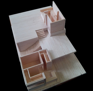
The monument illustrates her idea of variation of space, and express the idea of children & youth by the climbing wall on the monument. Students can climbing on the monument to explore more space in it.
Karen Clemmensen:
Secretive with low and angular
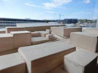
Use of 'low building' and ' angular' create the sense of secretive in the monument. The monument is flat, and few surprise space inside, also illustrated the idea of humble in Karen clemmensen design.
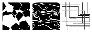
36 TEXTURE LIGHT TO DARK
Children & youth + intimate = variation of space
Low building + angular = secretive
3 TEXTURE CHOOSE:
LIGHT
MEDIUM
DARK
3 PARALLEL PROJECTION
12 AXONOMETRIC DRAWINGS
SKETCH UP MODEL
Link:
Tuesday, 30 April 2013
Monday, 29 April 2013
EXP2: RESEARCH FOR THE ARCHITECTS
Dorte mandrup-poulsen:
concept:
angular, children & young, variation of space
Final monument concept: variation of space
Final monument concept: variation of space
Dorte mandrup-poulsen's building is all geometric form. She also like the sense of lightweight, which using the thin material, and glass, to make it lightweight.
karen clemmensen:
concept: intimate, low building, settle
Final monument concept: Secretive
Final monument concept: Secretive
Karen's building is creating the sense of humble. the building she design is not a tall and angular building. She prefers the low building, with only several levels. But the scale of the building is big, and wide.
LANDSCAPE:
In the part of designing landscape.
At first, i try to find the similarity between both architects. They are all Denmark architect, and almost their building is located in Denmark.
Denmark landscape is quite flat, but surrounded by ocean, and a lots of island.
For their own architecture's landscape, the buildings are surrounding by the tree, and in a flat landscape.
In the coast of the land, there are lot of rocks.
So that, i decide to create a flat land, a long river divided the two architecture in two sides and connected by a bridge
The landform design for the students meeting will on the river, like a platform on the water.
Subscribe to:
Posts (Atom)


